Friday, December 5, 2014

Game of Thrones


The Simpsons does Game of Thrones!

https://www.youtube.com/watch?v=ZcSSpw7t044


Not only did The Simpsons pay homage of Game of Thrones opening but many others have done as well (just like the others shown in class). Parody videos or not Game of Thrones videos are all over the internet. I had the opportunity to only watch what was shown in class. Therefore, at the moment I cannot comment much but I am eager to start watching the show. According to vulture.com author Josef Adalian reveals that Game of Thrones is currently HBO’s most watched television show ever, surpassing The Sopranos to a growing audience of 18.4 million viewers each week. In my opinion, from the little I have watched the genre becomes a little blurred. It seems to be a blend of historical drama and a fantasy genre. Game of Thrones offers a great deal of everything: excellent acting, violence, blood, romance, incest, cute wolves’ as pets, dragons, etc. And especially an escape from realism which in some cases this can be appealing for the viewer and therefore, this could be one of the reasons why this show is so popular.


work cited:
Adalian, Josef. “Game of Thrones Is Now HBO’s Most Watched Show Ever.” Vulture.com. New York Media LLC, 5 June 2014. Web. 3 Dec. 2014. <http://www.vulture.com/2014/06/game-of-thrones-now-hbos-most-watched-show-ever.html>.

(The Simpson Video is from YouTube)

Tuesday, December 2, 2014

More than just color?

Like others, today I will be discussing The Wizard of Oz and how it’s colors interest me. It might not interest me for the same reason it might for others. The colors in the movie represent the financial situation of the time. The symbolism stretches far beyond color but color is one of the most significant variables of the film. I will explain of the colors in The Wizard of Oz are latent expressions of the gold/silver based economic system.


Lets start off with the Ruby Slippers. In the book the slippers were Silver representing the silver standard that was trying to be established. In the film the Ruby slippers were made to take full advantage of the new technicolor abilities that were available.

The emerald city was of course representative of paper money and also the political center of Oz, or in other words D.C. To get to the Emerald City, one must first travel on the Golden Brick Road, or follow the Gold standard. This was another way of saying that DC is founded on the banking system.


Besides the prevalence of these colors, the film starts in a monochromatic color scheme suddenly turning colorful once Dorothy gets ducked up by the Twister. I personally believe that this is a way to show the difference between a low income midwestern family and how it is flipped by a new age of banking systems and how things would take a turn for the average American.

The theme of Gold, Silver, and Emerald is one that stays with the film throughout. The path to the capital is paved in gold. Theres much more to the symbolism in The Wizard of Oz, but as far as colors go, it’s amazing to see what little details can mean so much more.

Take This Waltz


One of my favorite films shot on color is Sarah Polley’s Take This Waltz. Throughout the piece, the characters wear complementary colors to show how vibrant the characters are when they are together. Michelle Williams’ and Luke Kirby’s characters are always seen wearing blue and orange-red together. So all of the scenes they do together, make them look vibrant which matches the characters’ passion for one another. The film is also shot with warm lightening which creates this sun set feel. This sun set effect matches one of the themes of the film of being stuck between two places. A sun set is in between day and night. The whole film just feels warm and organic because of these color pallets.  


Color

Some of the early movies that use Technicolor were The Wizard of Oz (1939) and The Blue Bird (1940). The year 1939, was a big year for colored film and The Wizard of Oz especially, exemplifies this by surrounding everything by color. The reasons The Blue Bird and The Wizard of Oz are mentioned is because they both use the same techniques to introduce color to film, yet in a different time and place. Both films start off black and white and then enters the world of color.

I find this shift toward color very fascinating because, it turns into a movie about color. It also works as an effective way to introduce color to the viewer and to cause a change of emotion or engender a reaction. Maybe the thought process was, once the viewer sees color they will see a whole new beginning for film. Also, for the viewer to possibly be able to quickly form an opinion and distinguish between the two scenes of black and white versus color. Color is explored and is exploited in The Wizard of OZ to show the viewer how color can be used in a variety of different ways. Just take a look at this purple horse! When would an audience expect to see a purple horse on television?


Another commonality between The Wizard of Oz and The Blue Bird is that color is introduced at the same time as a fairy. Fairies are imaginary creatures and all the viewer’s share the juxtaposition of unreal magic and real color.
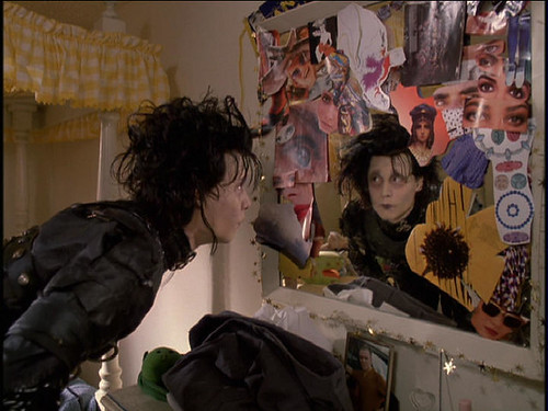
(Fairy with various patches of color) 
(Fairy with a pink glamorous glittery dress and bright red lips)


One aspect I thought was very interesting about The Wizard of Oz, is the use of nature to represent color. In the beginning of the movie there is a tornado in Kansas during the black and white scenes. Tornadoes remind me of dark colors, dust, and tragedy–the total contrary to her arrival in the imaginary land of OZ. Dorothy finally concludes “We must be over the rainbow.” Dorothy realizes she left a gray dull place to a place such
like a rainbow, filled with beautiful colors and magic everywhere.


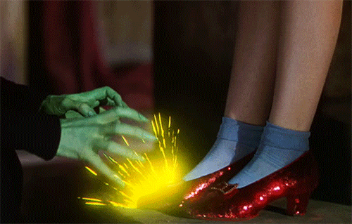
Interestingly enough, the use of Technicolor’s magic was not wasted at any moment. In The Wizard of OZ novel, the slippers are silver. The film was possibly very eager to show off Technicolor’s magical appearance on television and made them ruby and glittery.


As far as black and white movies can be mysterious, color movies also work in their own mysterious ways, by touching our emotion based off of the color shown. I agree with cinematographer Vittorio Storaro that color changes your state and it touches the emotion. Color is a powerful form of appeal to the viewer’s emotions. A color image provides realism and despite the land of OZ being a fantasy, color makes that fantasy seem real.

Just imagine entering the wonderful land of OZ without color. There would not be a point to follow the “yellow brick road.”


It would not be the “yellow brick road” without the help of these three-strip colors red, green and blue to make it happen.


The use of color in The Wizard of Oz has a meaning and purpose. One of them being the imitation of the three-strip colors, portrayed in the three munchkins who dance and sing in the film.

The use of Technicolor in both The Wizard of Oz and The Blue Bird was artfully portrayed in the film. Technicolor produced a rich and vivid image of different sceneries and tones for the movies. I think as much as people may have a nostalgia for black and white television movies or programs, according to Marshall McLuhan’s theory it’s the color that affects everybody and not the content. The fairy in the film The Blue Bird, says to Shirley Temple: “The blue bird brings happiness,” and that is what color brings – Happiness.

Monday, December 1, 2014

The Wizard of Oz: Color As A Tool

The Wizard of Oz is a classic. It's a film nearly everyone has seen and adored for years. It's past down from generation to generation, cementing itself as a timeless piece of cinema that people of all ages can enjoy. However, one of the aspects of the film that isn't delved into as thoroughly as one would hope is the brilliant use of color and its use as a storytelling technique that does wonders for the narrative.


The Wizard of Oz was one of the very first films to be presented in technicolor and to this day its look has managed to hold up tremendously, never appearing dated. Color plays an integral role within the narrative, mostly pertaining to Dorothy's transition from the real world into the magical land known as Oz. The opening half hour of the film is presented in a sepia tone, a popular practice for that particular time in cinema, to present the rather gloomy life Dorothy leads with her family in Kansas. You see her desire to travel and her immense curiosity of the world that surrounds her take hold, leaving her unsatisfied with her seemingly "ordinary" life. The use of the sepia palette helps express the bland nature of her every day life, the monotony and lifeless routines she has to endure and watch others she loves participate in. Simply, she wants something more, acting as a stimulus for her classic "Somewhere Over The Rainbow" ballad.

Then, the infamous tornado scene takes place in which it is seen tearing through Kansas with ease. The storm eventually reaches Dorothy's home and the tornado lifts her house off of the ground and sends it swirling into the land we all know as Oz. The transition of color in this sequence is absolutely incredible. Dorothy opens the door and color bursts through the screen, vibrant colors rocking the senses of the viewer. She steps outside her home and bears witness to a land of immense color, a land that appears simply magical. The sepia tone previously established is vanquished and color permeates the screen like it had never done before. Now this use of color is not only appealing to the eye, but it also serves a useful narrative purpose as well. Compared to the monotony of her life in Kansas, Oz strikes the viewer as the complete opposite setting. Dorothy is seen smiling incessantly, her mind running around trying to process the beauty and scale of the land around her. The joy Oz brings her is written all over her face, leading the viewer to the conclusion that she may have found what was over the rainbow after all. 

Also, the color green plays a central role in the film as well. The color infiltrates the film numerous times as Dorothy travels toward the Emerald City on the yellow brick road in order to the almighty and powerful Oz. I'm sure there have been a myriad of interpretations of the use of the color green in the film, but I personally think the color represents daunting or intimidating visuals through Dorothy's eyes. As Dorothy travels on her journey the Emerald City looms over the land, casting a considerable glow that causes Dorothy to be in awe as she inches closer to the gates of the city. When she first meets the Scarecrow, Tin Man, and Lion, green surrounds these characters before they are properly introduced. Dorothy appears cautious, leaning toward frightened as she approaches each of the main characters. Each character she meets initially intimidates or frightens her. Of course, you have to talk about the Wicked Witch of the West who's skin itself is green, giving her a ghastly and terrifying appearance. When she makes her first appearance, she terrifies Dorothy and sends shivers down her spine with her loaded threats and sharp, cruel words. Then, there's the Emerald City itself which is essentially all the color green. The citizens of the city dress in all green and Oz himself, when projected through the smoke, has a green appearance. Oz scares the life out of all the main characters before making his daunting request. In each occasion, the color green represented something Dorothy found frightening or intimidating, giving an uneasy essence to the color in general throughout the film. Though the color looks beautiful in the film, it proves appearances can be quite deceiving. 

Color gives The Wizard of Oz new layers beneath the spectacle and family fun that lies above the surface. The color serves the story well, implemented as an effective narrative technique that enhances the quality of the film incredibly. There's so much one could dissect in the film and I could even go on further about the wonderful use of color, but we don't all watch it to delve into the meaning of the colors it presents. We watch The Wizard of Oz to get swept up in the magic its able to provide and the warm, comforting feeling it is able to give us upon each viewing. The Wizard of Oz will always be a favorite of mine. It is not only a favorite of mine because it happens to be so much fun to watch and quote, but because of the fact that with each passing year I'm able to notice something new and extraordinary upon another viewing. Simply put, The Wizard of Oz is the gift that keeps on giving.


Edward Scissorhands - A Palette of Pop and Punk


The colors utilized in Edward Scissorhands alludes to the time period this story takes place in. Although a particular time period is not explicitly mentioned, one can assume that with a spectrum of light pastels and a palette of colors that "pop", the setting takes place around the time of the 1950's. The main storyline of this film is that a young man with scissors for hands but has a kind soul falls in love with a young woman. The gothic and romantic overtones and undertones are emulated through the color palette chosen for this film.

The lush green grass in this shot shows that there is life. I also think that the colors of the sunset: pink and blue can also convey that there is harmony, balance and serenity since these two colors compliment those present within the houses and cars. However, the electric pastel green colored house can symbolize that within the neighborhood, there is something alien present (Edward Scissorhands himself). Moreover, this film is one that is both dark, yet romantic. I think that the color palette chosen for many scenes support this theme. There are quite a bit of fantasy-like elements present within this Tim Burton film in regard to color as well. 

In this still shot, Edward Scissorhand's black greatly contrasts with the other bright colors present. These colors reflect one of the main conflicts in the plot (that he is different and is an outsider in the neighborhood). The sunshine yellow in this shot portrays that there is happiness present, but at the same time shows warning and caution. Here Edward is not in his own room, but in Kim's room and all of the magazine cut-out eyes are looking at him. This can symbolize that he is a spectacle and these eyes staring at him parallel the fact that people are always looking at him and judging him for being different. The mirror reflecting back at him shows both his dark and light appearance in color and character. More specifically, his skin tone is very pale (light) while his clothes and hair are black. Therefore he sticks out, especially when he is surrounded by bright/light colors such as the yellow, purple magazine clippings and beige walls.

When Edward Scissorhands is wearing black, white and gray together I think it can represent the complexity of his character. While white can symbolize purity, birth and rebirth, black can symbolize death, darkness and evil. Scissorhands grey pants therefore can represent a blending of them both since black and white juxtapose one another. The ladies dressed in bright colors around him emphasize the disparity between their characters. 

Again, this is a still shot where bright colors are present (in the Christmas lights in the background and the alien green colored garage). Edward is here sitting wearing all black next to a light colored dog on a grey colored sidewalk...encompassing all of the film's color palette theme once again!

Wednesday, November 26, 2014

F*** the itinerary


My personal favorite colored movie cannot be boiled down to one, but rather multiple movies all directed by Wes Anderson. His signature style can be compared to one of my hometown pizza (square & thin crusted) restaurants, people either love it or hate it. With the implication that color effects emotions such as, increased blood pressure, Anderson executes that very well. For each of his films, they almost entrance you with the desire to be a part of that time and setting, just with the one of his many contributing factors like his color palette. Here are some examples of writers who elaborated on his unique style:

Emily Temple from flovorwire,
“The colors Anderson picks are remarkably true to brand across his catalog — boy, does he love those warm, saturated yellows  — but we think it’s even more impressive that we can easily recall the feeling of all of these films just by looking at five of their principal colors.”


Lauren Duca from Huffington Post,
“Wes Anderson has always had a very particular way of creating these magical, specific worlds where emotional events of colossal importance occur.”


Caitlin Dewey from Washington Post,
“Saturated, ’70s color palette? Yep. Of all the mainstream directors working today, few have such defined and recognizable aesthetics as Anderson.”


Laura Havlin from anothermag,

“The fictional worlds evoked in film by director Wes Anderson have such a precise colouration – the very particular pastel-hues that paint the skies, drench the buildings and dress the characters, render Anderson’s microcosms almost dream-like. The hazy-hued lens through which we peer into the director’s unique world has a retro quality that casts his films in a nostalgia for a time that could have been.”